
Pie and donut charts
Pie and Donuts Charts are a great way to visualize data as a percentage of a total.
Requirements
- To create a data element, you must have Can Edit access to the individual workbook and be in Edit mode.
- Many exploratory actions are also supported in Explore mode; see Workbook modes.
Plot Options
Pie and donut charts charts can be created via the PAGE ELEMENTS section of your workbook's editor panel or directly from an existing data element. 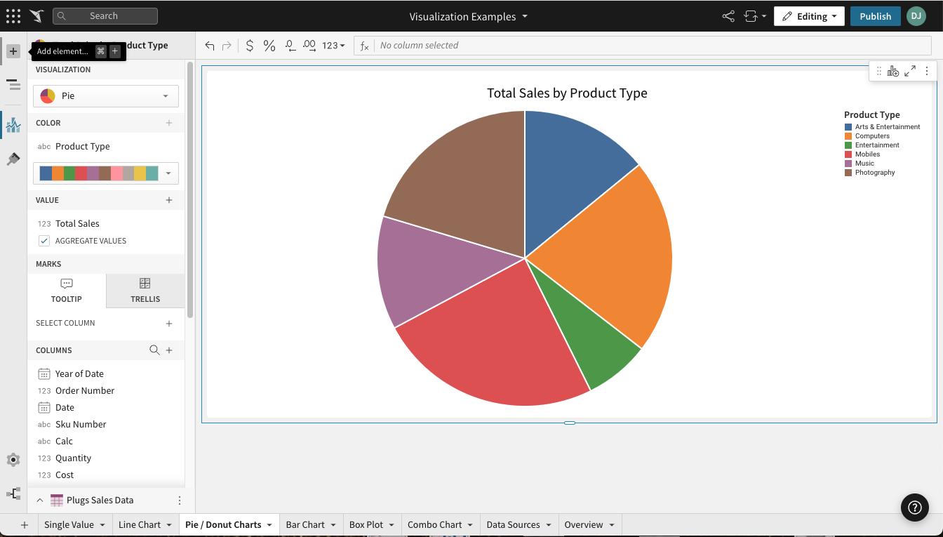
Required Fields
- COLOR (1 column)
- VALUE (1+ columns)
Columns added to the VALUE field are aggregated by default. Aggregation type (e.g. Sum vs Count) is dependent on the original column’s value type (e.g. text, number, date, etc).
Example: A numeric column [Sales Amount] will create a new calculated column [Sum of Sales Amount].
Marks
- TOOLTIP: choose columns to show when hovering over points in the chart
- TRELLIS: select columns to serve as Trellis Rows or Columns, splitting the chart into separate charts
Format Options
To begin editing an visualization’s format options:
Before you start: This action uses the editor panel. If you have not done so already, open the editor panel from either Explore or Edit mode.
- In the editor panel, select
 Element format.
 - Select a format option to view and edit its settings.
The following format categories are available for pie and donut charts:
- BACKGROUND
- TITLE
- LEGEND
- DATA LABELS
Updated 8 days ago
Related resources