
Build a funnel chart
Funnel charts are typically used to measure values across sequential stages in a linear process. Create funnel charts to evaluate inputs across each stage and discover potential issues and bottlenecks in a workflow.
This document details basic funnel chart requirements and introduces key properties and format options to help you enhance your workbook visualizations.

Example use cases:
- Product marketing analytics: Monitor an email campaign pipeline to understand where most prospects are being lost, then assess opportunities for greater conversion.
- Sales analytics: Track the number of prospects in each stage of the sales cycle to identify where most prospects are currently held, then assess investments in specific sales motions.
- HR analytics: Analyze recruiting process stages by demographics (like age, gender, and application submitted) to measure pipeline dropoff rate for specific candidate groups, then determine if dropoff exceeds expectations and indicates a need for process refinement.
User requirements
The ability to create funnel charts and other visualizations requires the following:
- You must be assigned an account type with the Edit Workbook and/or Explore Workbook permission enabled.
- You must be the workbook owner or be granted Can explore or Can edit workbook permission.
If you're granted Can explore access to the workbook, you can create and modify visualization properties and formatting in Explore mode, but you cannot publish your changes.
Workbook prerequisite
Before you can build a funnel chart, you must add a new visualization element and select a data source.
At the core of every visualization is an underlying data table (derived from the data source) that supplies the information visualized by the chart. As you build a funnel chart, Sigma automatically groups, aggregates, and calculates the underlying data to create source columns for various visualization properties. You can view the underlying data table while configuring the chart to see how the data is applied.
Basic funnel chart requirements
To display a funnel chart, configure the following properties in the  Element properties panel:
- Visualization - chart type displayed in the workbook
- Stage - source column that defines the stages
- Value - source column that defines the variable
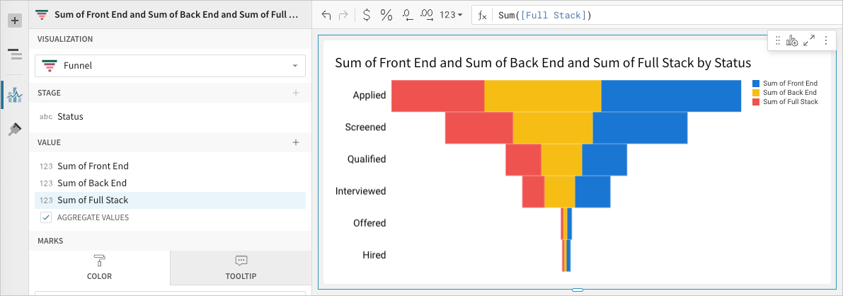
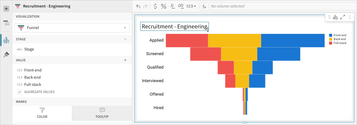
In a funnel chart, stages reference nominal categories (like campaign pipeline, sales pipeline, recruitment stages) presented as a horizontal bars. A variable measures a value (like number of leads, prospects, candidates) for each stage and determines the width of each bar.
The first stage, shown at the top of the chart, typically represents the initial input of the process and corresponds with the largest stage value (and widest bar). Because value dropoff occurs as data flows through the process, each stage measures a subset of the previous stage value. As a result, the chart progressively narrows and creates a funnel shape.
Select the visualization type
Once you add a new visualization to a workbook, select the visualization type:
- In the Visualization property, click the dropdown field and select Funnel from the list.
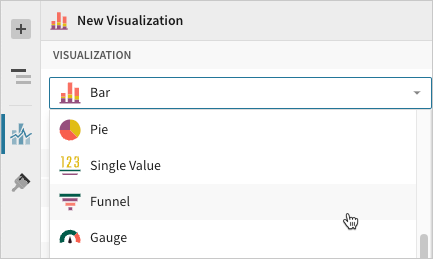
You can also use this dropdown field to convert an existing visualization to a different type. Sigma retains all property and format configurations shared by the initial and new type. Unshared properties and formatting are not saved or restored if you further convert the visualization.
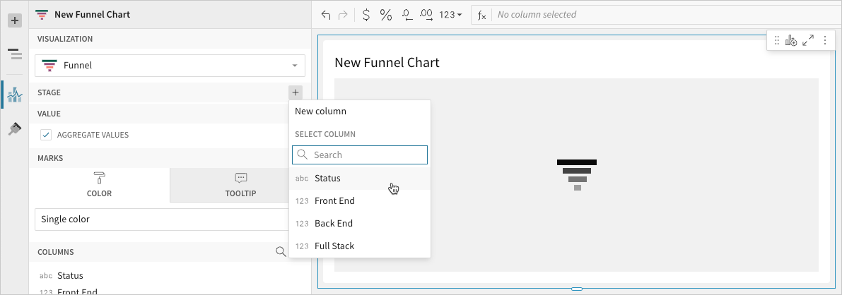
Define the stages
Select a source column to define the stages.
When your data source includes a single column with stage names as values, follow the steps below and add this column to the Stage property. Alternatively, if the data source breaks down each stage as a distinct column of data, skip this step and aggregate the individual stage columns in the Value property (see Define the Variable).
-
In the Stage property, click
 Add column and select an option from the menu:
- To generate stage names based on distinct values in an existing column, search or scroll the Select column list and select the preferred column name.
- To generate stage names based on a custom formula, select New column and enter a formula in the toolbar.
You can also select or replace an existing column by dragging and dropping a column name from the Columns list to the Stage property.
Define the variable
Configure a source column to define the variable. Sigma automatically aggregates column values associated with the same stage.
-
In the Value property, click
 Add calculation and select an option from the menu:
- To aggregate values of an existing column, search or scroll the Aggregate column list and select the preferred column name.
- To calculate values based on a custom formula, select New column and enter a formula in the toolbar.
- To count the number of rows associated with each stage, select Row count.
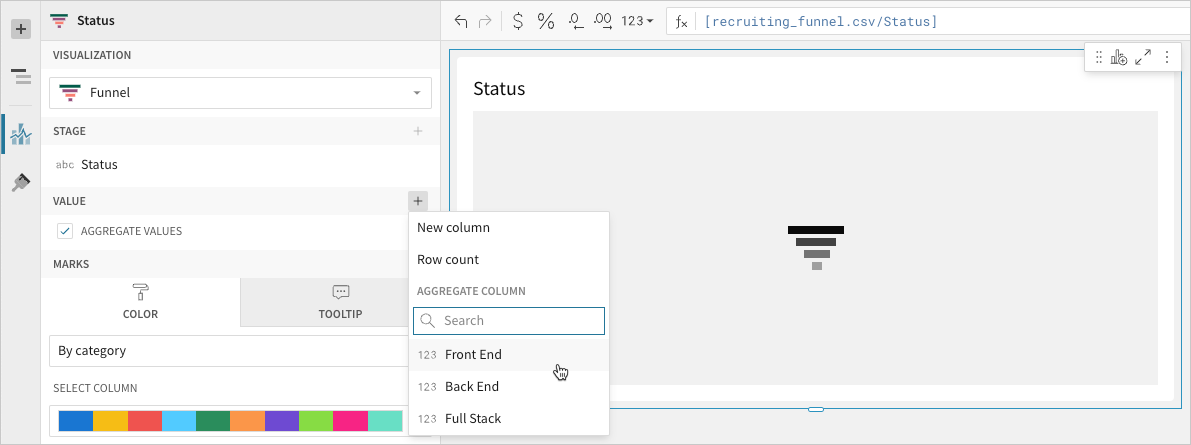
You can also select an existing column by dragging and dropping a column name from the Columns list to the Value property.
-
[optional] Control how the source column data is calculated and displayed in the chart:
- Hover over the source column name, then click the caret (
 ) to open the column menu.
 - Hover over any of the following items and select the preferred option:
- Set aggregate - Calculate values based on the selected aggregation method.
- Transform - Convert the column to the selected data value type.
- Format - Display data labels in the selected format.
To plot the source column data without aggregating values, clear the Aggregate values checkbox in the Value property. If this results in an incomplete chart that exceeds the 25,000 data point limit, reaggregate the values or apply data filters to reduce the number of data points.
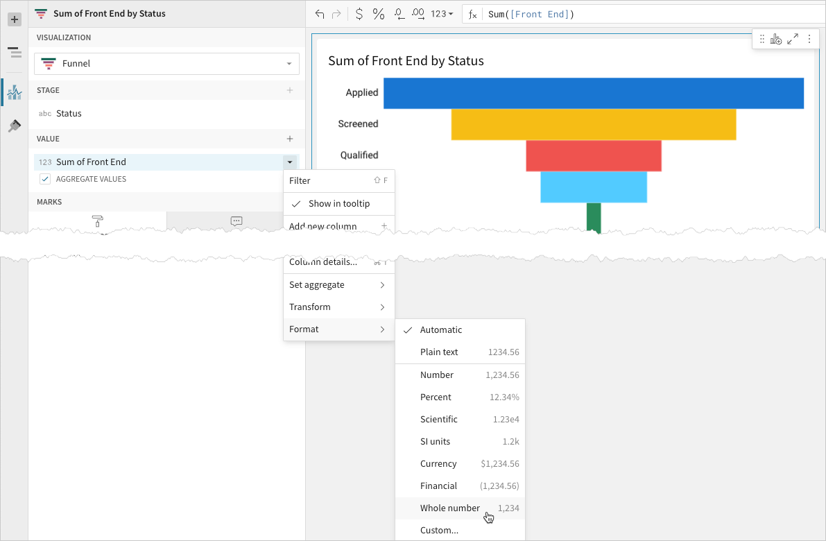
You can also use the toolbar to change the aggregation method (using the formula) and data label format.
- Hover over the source column name, then click the caret (
-
[optional] Repeat the previous steps to configure multiple stage value source columns. Sigma plots the columns as stacked series on the chart.
-
[optional] Sigma auto-generates source column names and chart titles to reflect the visualized data, but you can customize these fields as needed:
- To rename a source column, double-click the column name in the Stage or Value property, then enter a new name. Changes are reflected in the default chart title.
- To edit the chart title, double-click the title in the visualization, then enter a new title.
Sigma auto-generates the default chart title only. Once the title is customized, it no longer reflects changes to source columns and their names.
Advanced funnel chart properties and formatting
Sigma features various properties and format options that give you the flexibility to build detailed funnel charts.
The following sections introduce configurations that can enhance your charts and help you deliver specific insights with meaningful and actionable information.
Configure mark colors
Configure chart mark colors in the  Element properties > Marks > Color tab to differentiate data.
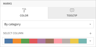
| By category | If only one source column is configured in the Value property, the chart defaults to categorical colors that represent stages. If multiple source columns are configured in the Value property, the chart defaults to stacked series with categorical colors that represent each of those columns. To change the default categorical color variable, select a source column, then select or customize a color palette. |   |
| By scale | Select a source column to define a scaled color variable, then select a color range to apply to the marks. |  |
Customize data labels
Customize data labels representing conversion rates, stage values, and stage names in the  Element format > Data labels section.
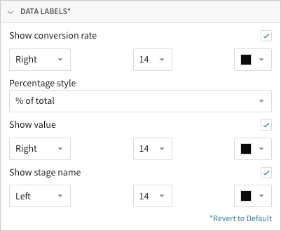
In addition to showing or hiding the different types of data labels, you can customize the font size and color of each.
You can also select the position of each data label type relative to the chart marks:
| Left | Inline | Right |
 |  |  |
The funnel chart’s Color property may determine the availability of specific data labels and positions. For example, stage names can only be displayed inline when the chart features categorical colors that represent stages (see the By category details in Configure mark colors).
When you show conversion rates, you can choose a Percentage style option to determine how conversion rates are calculated:
| Percentage style | |
|---|---|
| % of total | Calculates the value of each stage against the value of the first stage (total value at the top of the funnel). Current stage / first stage = conversion rate |
| % of prior | Calculates the value of each stage against the value of the preceding stage. Current stage / preceding stage = conversion rate |
All funnel chart format options
Updated 5 months ago