
Add trend lines
Trend lines are lines added to visualizations to highlight and predict patterns across multiple values in a set of data. For example, you may want to track your company's overall pace of revenue growth over the past 5 years.
This article shows how to add, edit, and delete trend lines in visualizations.
Requirements
- To edit a visualization, you must have Can Edit or Can Explore access to the individual workbook.
- The visualization must have values plotted on both its X-AXIS and Y-AXIS. Both axes must also have a compatible scale type applied. The following scale types are compatible with trend lines: Linear, Time, Log, Pow, Sqrt.
- Trellised visualizations, stacked visualizations, and visualizations with values plotted on the COLOR field do not support trend lines.
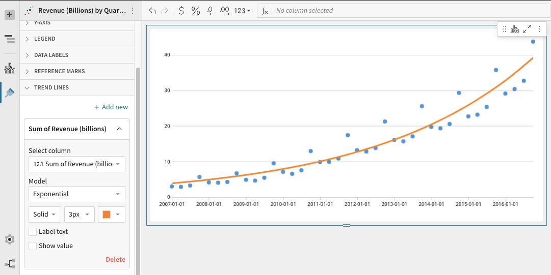
Trend Line Model Types
The following model types are available: Linear, Logarithmic, Exponential, Power, Quadratic, and Polynomial.
If you’re unsure which model type to choose, we recommend trying a few and picking the one that looks best with your data. A line’s R² value can also help you determine best fit.
Each model type is based on an underlying linear regression formula. These formulas are included below. However, understanding the math behind the line is not necessary for using trend lines in Sigma.

Determine Best Fit from R² Values
R-squared (R²) represents how well the trend line fits the data. This is based on variance between data points.
R² values are always between 0 and 1. Values closer to 0 signal that the line fit is worse, while values closer to 1 signify a better fit.
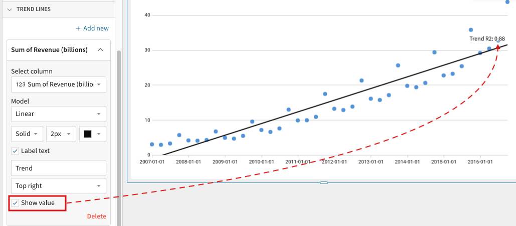
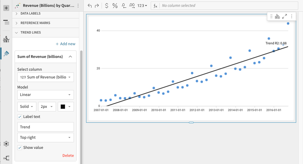
To include the R² value on a visualization's trend line, check the trend line's Show value option in the editor panel. The value will appear wherever the trend line label is positioned in relation to the line.
Add a Trend Line
To add a trend line to a visualization:
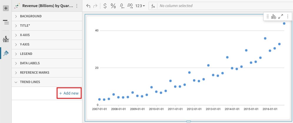
- Select the visualization.
To support trend lines, a visualization must have values plotted on both its X-AXIS and Y-AXIS. Both axes must also have a compatible scale type applied. The following scale types are compatible with trend lines: Linear, Time, Log, Pow, Sqrt.
Visualizations that meet any of the following do not support trend lines: trellised visualizations, stacked visualizations, and visualizations with values plotted on the COLOR field.
The column you want to use to calculate a trend should be plotted on the Y-AXIS. - Open the visualization's format panel.
- Click TREND LINES.
- Click + Add new.
- Click the new Trend line dropdown.
- Under Select column, select a column to use for the trend.
The available list contains only columns plotted on the visualization's Y-AXIS.
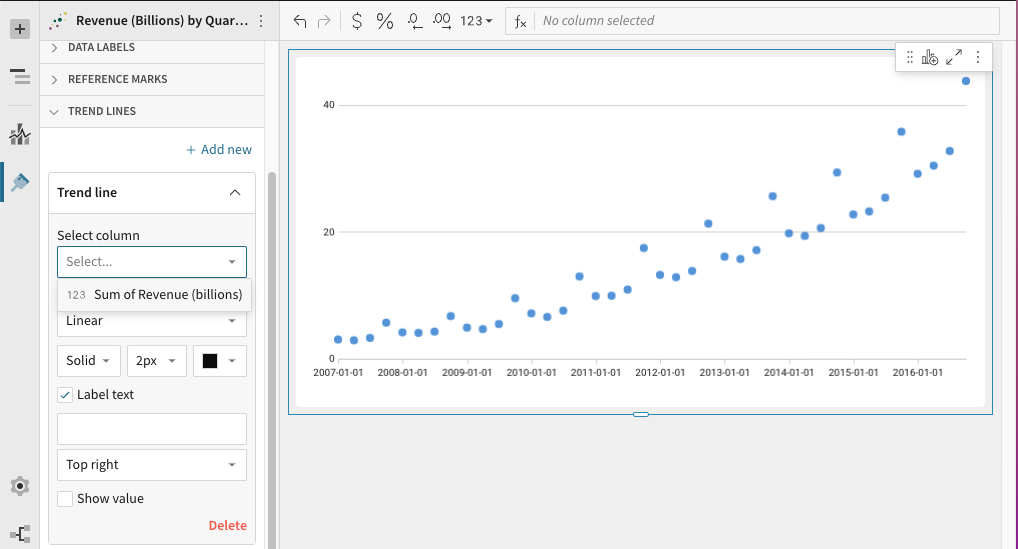
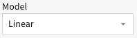
- Under Model, select a trend line model type:
-
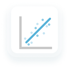
Linear: display as a best-fit straight line
-
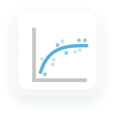
Logarithmic: used for data sets in which the rate of change increases or decreases quickly before leveling out
-
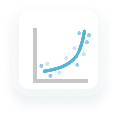
Exponential: used for data sets in which the values rise or fall at constantly increasing rates
-
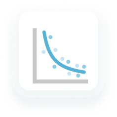
Power: used for data sets in which the values increase at a specific rate.
-
Polynomial: used when data fluctuates. They're helpful when analyzing gains and losses over a large period of time. Sigma's polynomial trend lines default to a polynomial order of 3. This value is configurable below.
-
Quadratic: 2nd-order polynomial trend lines used to smooth out fluctuations in a data set
-
[optional for Polynomial trend lines only] Under Degree, select a polynomial order between 3 and 7.
Polynomial order effects how many hills or valleys are present in the line. The higher the number, the more hills or valleys to expect. -
[optional] Select the line style: Solid, Dashed or Dotted. Then select its size and color.
-
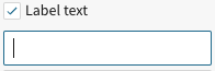
[optional] Enter a text label into the text box below the Label text checkbox.
For no label, leave the text box blank or uncheck Label text.
-
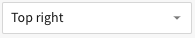
[optional] Select where you would like to position the label in relation to the line: Top right, Top left, Bottom right, Bottom left.
-
[optional] To show the line's R² value, check Show value.
R² represents how well the trend line fits the data based on variance between data points.
Edit a Trend Line
To Edit an existing trend line, enter Edit mode, then:
- Open the visualization's format panel.
- Click TREND LINES.
- Select the dropdown associated with the trend line.
- Make any of the following edits:
- Linear: display as a best-fit straight line
- Logarithmic: used for data sets in which the rate of change increases or decreases quickly before leveling out
- Exponential: used for data sets in which the values rise or fall at constantly increasing rates
- Power: used for data sets in which the values increase at a specific rate.
- Polynomial: used when data fluctuates. They're helpful when analyzing gains and losses over a large period of time. Sigma's polynomial trend lines default to a polynomial order of 3. This value is configurable below.
- Quadratic: 2nd-order polynomial trend lines used to smooth out fluctuations in a data set
- To select a new column to use for the trend, pick a column under Select column.
The available list contains only columns plotted on the visualization's Y-AXIS. - To change the line's model type, select a model type under Model.

- [optional for Polynomial trend lines only] Under Degree, select a polynomial order between 3 and 7.
- Select the line style: Solid, Dashed or Dotted.
- Select a new line size or color.
- To add a text label check the Label text checkbox, and type into the text box that appears below.
For no label, leave the text box blank or uncheck Label text.

- To position or reposition the label in relation to the line, select a position from the dropdown menu: Top right, Top left, Bottom right, Bottom left.

- To show/hide the line's R² value, check/uncheck Show value.
R² represents how well the trend line fits the data based on variance between data points.

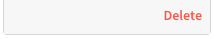
Delete a Trend Line
To delete a trend line, enter Edit mode, then:
- Open the visualization's format panel.
- Click TREND LINES.
- Select the dropdown associated with the trend line.
- In the bottom right corner of the trend line editor, click Delete.
Axis Scale Types
A visualization only supports trend lines if its columns are plotted on both its axes and if a trend line compatible scale type is applied. The following scale types are compatible with trend lines: Linear, Time, Log, Pow, Sqrt.
Visualizations that use an incompatible scale type display a warning message in the TREND LINES section of the format panel. To clear this warning and add a trend line, check your axes’ scale types and update as appropriate.
To change an axis' scale type:
- Open the visualization's format panel.
- Open the axis' format section: X-AXIS or Y-AXIS.
- Select an option from the Scale type dropdown menu.
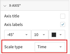
Not all visualizations support all scale types. The following scale types are trend line compatible:
- Linear: Plots data along the axis using a linear numeric scale
- Time: Plots data along the axis as time values
- Log: Plots data along the axis using a logarithmic scale
- Pow: Plots data along the axis using a power scale
- Sqrt: Plots data along the axis using a square-root scale
Updated 2 months ago